skip to main |
skip to sidebar
Not To Get Ahead of Myself, But ...
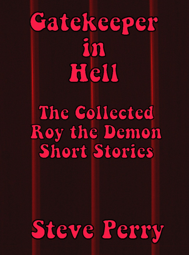
I've only got six and a half Roy stories done, and I'm thinking it'll take ten or twelve before I clump them together into a collection, but I like the notion, never having had a collection of my short stories published before. So I'm jumping the gun a little with cover designs, but, what-the-hell. I've fiddled with two so far.
One is a plain red with bars; the other is a tricked up image of Rodin's sculpture, "The Gates of Hell."
Which do you like better ... ?

7 comments:
I like the second one better, though I'm not a fan of the font you used for the title. It looks too early seventies to me.
I like the second one better, both for the background image and for the white text. The other feels hard to read.
Don't care for either - I like the original fire covers....it's catchy.
2nd one
I like the second one myself you have here. If I had to make a second choice it would be the original as Ed says. It is catchy :)
Always did like Rodin, so I'd say go with "The Gates of Hell".
Actually, it's a sixties font, which is kind of why I used it. I got it for Windowpane, my sixties novel, and that whole era has a lot of Heaven-or-Hell aspect to it, so it seemed appropriate, somehow. At some point, Roy is going to do some time-travel, and maybe do a deal with Johnson or Nixon, or both.
I appreciate the input. I lean toward the Rodin myself. I have a copy of The Thinker on my file cabinet I've had for forty years. Politically and socially, Rodin was something of a loon, but he had magic fingers when it came to clay.
Post a Comment